With a new console generation upon us, I thought it might be a good time to conduct sort of an opinionated survey of game art techniques, some old, some new, some speculative. Part of what I want to do here is to break down what I think is the disingenuous and handicapping binary between so-called "photorealistic" and "stylized" rendering, and to advocate for a more syncretic and intentional approach to 3D game imagery drawing on a variety of examples from what is at this point I think a more or less mature state of the art.
Consider it something like a "greatest hits" of individual rendering, animation and UX implementations, with some pet peeve kvetching along the way, but also highlighting some exciting recent developments and suggesting possible combinations of ideas illustrated therein.
 |
| Charles Bell, Double Bonus, 1987 |
Now, part of me enjoys, as a kind of gruesome spectator sport, the bathos that results from AAA's doomed forays into hyperrealism. Personally I don't think these poignantly lumbering monstrosities are worth the human sacrifice required to summon them, but I can at least appreciate the fascinating fault lines between the technical dexterity on display and the often alienating gestalt.
I don't want to throw the baby out with the bathwater, though. Part of what defines AAA production for me is its... maybe you could call it its content agnosticism. Its reliance on portable workflows and libraries of assets and effects that themselves are not necessarily wedded to the thematic demands of the current project.
| Ghost of Tsushima, 2020 |
On the other hand, many "stylized" games are essentially derivative, attempting to emulate the look of some extant media or genre, like a comic book or even an old PSX game.
What I'm advocating for is perhaps more akin to a AA sort of stance, one meant for small teams with discerning taste and strong direction, refining a suite of asset templates that can be carried across multiple projects without an overriding fidelity to any one referent, but rather utilizing a combination of effects intended to maximize the dignity and distinctness of each, while also just generally supporting an aesthetically satisfying user experience. That user being myself, of course.
 |
| Paul Gaugin, Christ on the Mount of Olives (detail), 1889 |
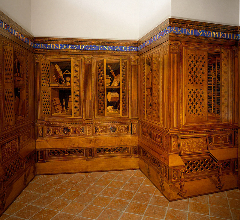
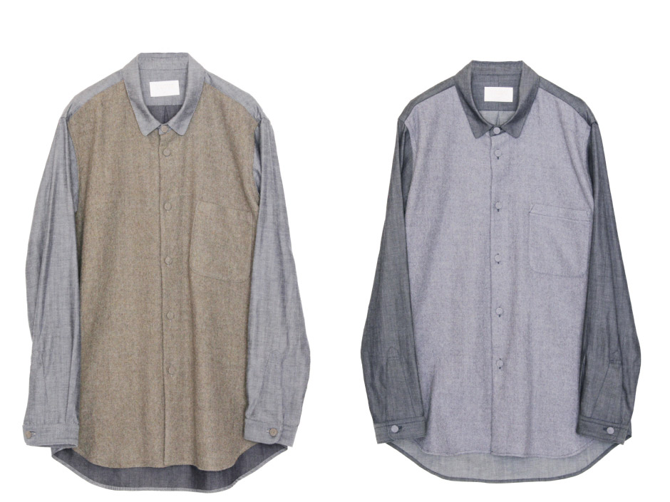
Materials
Let's start with materials. The transition to physically-based materials represents probably the biggest change to asset production in the last 10 or so years. Albedo, diffuse (what's the difference again?), normal, displacement, occlusion, cavity, specular, translucency, scatter, roughness, metalness... Surfaces in many games these days are treated with a deep stack of texture information addressing irregularities of depth and reaction to light. Where once this persuasive detail was conveyed through the color and contrast information in a solitary diffuse texture, "2.5D" UVs now push forward into the kind of tactile dimensionality that used to be reserved for actual geometry. This can bring a wonderful sense of depth and richness to scenes, but I do harbor a few misgivings.
One is that there can be something delicious about the tension between 2D and 3D elements. Take Zone of the Enders: The 2nd Runner, or Quadrilateral Cowboy. Here, surface irregularity is pretty irrelevant—much more important is that punchy, crisply chamfered articulation.
 |
Zone of the Enders: The 2nd Runner, 2003 |
Another tradeoff of relying on a standard library of materials is that a given material's graphic (superficial, ornamental, rhythmic) signature is often submerged under this sheet cake of shading behaviors. I'm all for illusionistic effects that pay respect to the wondrous phenomena of our physical universe and human visual system. But the (pseudo-) flat hierarchy of hyperreal rendering often dampens the poetry that can come through in 2D asset creation. I want constrained/curated material palettes, where each one feels essential and exciting, interpreted and compressed through the codec of a painter's sensitive eye.
That might mean some materials are treated in a more painterly fashion, some more photographic, some relying significantly more on processor-accelerated operations for specularity, reflectiveness, etc. Greater neighbor-to-neighbor contrast across the scene, almost more of a composite look—a balanced heterogeneity of intensities.
Picking out a palette for your materials? Here's some ideas:
- Pink plaster
- Amber phenolic resin
- Polychrome wood
- Beaver skin
- Doe skin
- Felt
- Chambray
- Chiffon
- Lacquer
- Vitreous enamel
- Cork
- Foam
- Porphyry
- Mica
- Wafer
- Chitin
- Raw silk
- Watered silk
- Tuff
- Jersey
- Oakum
- Mangalloy
- Printed polymer
- Bronze
- Tweed
- Tarpaulin
- Mussel shell
 |
| Balthus, Drawing Room, 1943 |
Look at the difference between Mario's denim in Super Mario Odyssey (2017) and Super Smash Bros. Brawl (2008). In Odyssey we've got this Mario 64-like royal blue, no wash, no indigo, no traces of undyed weft, but wide visible stitching, rivets, ticket pocket, and a highly pronounced diagonal ribbing, even more pronounced on the slightly washed out rims. In Brawl that bias is less front-and-center and instead denim-ness is attested through uneven indigo dye, noise, and dimmer, more traditional orange stitching. To me, Brawl's looks more like denim. Odyssey's looks more like, I dunno, gabardine? Drill? Why are we even talking about this? It's silly. Well, I guess artists for flagship titles have to communicate material through more than just flat colors these days, even for cartoon icons like Mario. They both look goofy to me, but at least with Brawl I can be like, yeah, fuck it, Mario wears denim, he's a denimhead, got a problem? In Odyssey it just makes me a bit uncomfortable.
 |
| Bloodborne, 2015 |
Bloodborne has amazing costumes. Never do I appreciate the high-resolution image in Bloodborne more than when I swivel the camera into a nearby cliff face to get a close-up on my natty blood-soaked hunter and discover their habit incorporates a censer in the form of a pendant necklace. Details like these do some wonderfully subtle worldbuilding, but unfortunately not every detail is so subtle. Again we've got the kind of Fresnel-catching fabric texture that in real life is only directly visible really close up scaled up and exaggerated to where it starts to feel a little desperate.
Ideally that kind of minutia would be addressed to an extreme LoD (level-of-detail) layer. Now I don't know exactly how games like Bloodborne handle level-of-detail on the texture level, at least for things like normal and specular maps, but I do know they've still got good old mip maps, which usually are automatically generated by the engine to improve performance and reduce aliasing. It seems like the creative use of mip maps has become a bit of a lost art, though. Nintendo was especially good at manually inserting entirely different images at different mip levels (sometimes with parallax) to create some really beautiful distance-based effects without the help of modern shaders.
High apparent levels of detail on distant objects often harms scene legibility. It's just overwhelming, and means more reliance on atmospherics, leading lines, scale differentials and forced perspective etc. to convey distance. Skyward Sword isn't the best-looking game, but I feel Nintendo EAD might have been onto something with its Cézanne-y impressionistic filtering.
 |
| Paul Cézanne, The Card Players, 1893 - 1896 |
Speaking of Cézanne—check out the colors on the pipe smoker's coat. These might not be the right colors from every angle in every lighting condition, but they do come together to make for a pretty lively brown, don't they? I'd like to see more combinations of texture and shader work that lead to saturated (even chemical) cangiante and variegated regions of color of contrasting temperatures that respond to variable lighting and viewing conditions and converge upon a proper base tone, like brown. All in all, I wouldn't mind seeing more game art take inspiration from trout.
To summarize:
Peeves
- Exaggerated specularity, especially on more matte materials
- Indiscriminate intensity of UV information across materials
- Insufficient LoDs, insecure cheesing of scale
Preferences
- Texture as rhythm
- Privileging of a material's graphic "signature"
- Intriguing interplay between 2D and 3D assets, e.g. tromp-l'oeil, camouflage
- Discretionary selection of materials
- Unevenly distributed intensity of non-color UV information across materials in a given scene
- Artistic, perception/UX-informed management of level-of-detail, possibly even at the mip level
- Impressionistic compression/filtering
- Saturation-preserving cangiante, mixed-temperature color shifts across highlights and shadows determined by material type (converging to albedo)
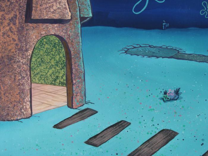
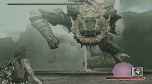
 |
Quake II RTX, 2020 |
Lighting & color
First order of business: ambient occlusion—take a hike. The bookcase is against the wall. I get it. I'd rather have hard, chromatic shadows, or even no shadows, than the hacky, wimpy diffuse "shadows" produced with ambient occlusion. At least as it's commonly implemented. I don't know, I guess it works on, like, flush corners.
It's nice I suppose that with OLEDs and HDR and such it's possible to get real lifelike brightness and contrast ranges with real blacks. Even so, I'm a bit fatigued by the lighting in many "adult" video games—this heavy chiaroscuro with inky colorless shadows, eye-searing specular highlights, little ambient light but if the sun's out it's canted at one of those magical angles in which one can detect all manner of particles—dust motes, embers—suspended in volumetric god rays.
When it's a game like Wolfenstein where I have to quickly locate and respond to threats, find exits, and generally analyze topography for tactical advantage, the heavy "cinematic" contrast and abundance of cosmetic noise makes me feel like handing the controller to someone else.
 |
Wolfenstein II: The New Colossus, 2017 |
I mean, even in this non-combat scene—look at how dark the shadows on those balloons are. What's going on here?
Horror games would seem to have the most legitimate claim to chiaroscuro. Silent Hill 3 is still one of the all-around best-looking 3D video games. Everything outside the cone of your flashlight is not for you to see...
 |
Silent Hill 3, 2003 |
I must admit I'm optimistic about global illumination, especially (at least for some scenes) dynamic GI, whether that be based on triangles, voxels, signed distance fields, or some combination thereof. When you start getting bounced hues, emissive materials, soft shadows, real-time reflections and boosted ambient coverage, the resulting image for whatever reason seems to shift toward something much more genial and bewitching, like a window's been cracked open, letting out the stagnant air. You need good denoising to pull it off, but already I've seen real-time, (relatively) high frame-rate implementations that capture something of the tonic freshness of real-world vision.
 |
Battlefield V, 2018 |
So, yes, I'm glad that with OLEDs, HDR, ray-traced lighting and reflections and sophisticated post-processing (motion blur, depth of field, etc.), it seems developers may finally achieve the deep, shiny, high-contrast cinematic look they've been fudging for over a decade.
Now that we've taken care of that, let's look at some other approaches to lighting. I still have a soft spot for the eerie, subdued, photocollaged realism of Half-Life 2. Those overcast electrum skyboxes. Those almost drab yet ever so pastel, creamy—auroral—tones...
 |
Half-Life 2, 2004 |
Target renders in my opinion would do well to simulate overcast and evenly lit conditions where chrominance provides relatively more information and interest than brightness. Another thing Half-Life 2 does better than many of its successors is respect its audience's intelligence when it comes to temperature and mood. It's frankly insulting how facile so many productions are with their color palettes. This scene is red because it's in Hell and you're angry. I might blame the concept artists but then again—Half-Life 2's final render is so much more intelligent and haunting than its concept art.
Some other lighting and color balance inspirations:
 |
Puce Moment, 1949 |
 |
| Isaac Levitan, March, 1895 |
 |
| Richard Diebenkorn, Interior with Doorway, 1962 (left), Ingleside, 1963 (right) |
 |
| Henri Matisse, Interior with Goldfish, 1914 (left), Interior with a Violin, 1917 (right) |
 |
Perfect Blue, 1997 |
 |
| Rinko Kawauchi, Untitled (I-62), 2011 |
 |
| Lotte Laserstein, Evening Over Potsdam, 1930 |
 |
| B. Anthony Stewart for National Geographic, July 1948 |
 |
Black Sin, 1989 |
 |
| Sergey Prokudin-Gorsky, 1905 - 1915 |
 |
Punch-Drunk Love, 2002 |
 |
| Fantasia, 1940 |
Bounced carnelian in Puce Moment...
Periwinkle shadows on snow and ruddy brown shadows on the butter-yellow house in the Isaac Levitan...
Exposed props in Diebenkorn and Matisse's HDR-y open interiors...
Blue glow off white highlights on maroon water in Perfect Blue...
Spidery yet matter-of-fact cyan in Kawauchi's disquieting C-print of the dead deer...
Lotte Laserstein's cloudy, blotchy naturalism...
Cold, silvery highlights on the girls in the shot for National Geographic...
Straub-Huillet's candid, quietly green-favoring bucolic settings...
Prokudin-Gorsky's indescribably roscid additive color...
Paul Thomas Anderson's creamsicle tungsten in twilight...
Technicolor blorange in the live-action interstitials from Fantasia...
So, again—
Peeves
- Noticeable screenspace ambient occlusion (as a kind of shadow indication; as a (chromatic) edge gradient it's okay I guess)
- Punishingly harsh and inky chiaroscuro, especially in sunlit scenes—though this can look good in more flatly textured styles
- Overeager, "unearned" volumetric lighting displays and general preponderance of rare dramatic directional lighting conditions
- Super-HD destruction of neighboring color falloff / blending
- Heavy-handed color schemes and digital-Hollywood color grading
Preferences
- HDR with humane aperture transitions
- Saturated chromatic shadows
- Soft, filmic falloff
- Genuine global illumination with scatter and reflections
- Overcast and temperate lighting conditions
- Complementary temperatures and ambivalent, sophisticated palettes
- Color as provider of interest over acuity—after all, edge detection is easier with a free and mobile camera
- Deliberate but subtle tone balancing—a little goes a long way!
 |
| Ico, 2001 |
Characters
Shading
Obviously some overlap with lighting. But I thought I'd prefer to speak in the context of characters, or "actors," on the idea of—well, I guess you'd call it cel shading.
As a refresher, cel (or sometimes "toon") shading typically involves a process by which a character model is toonified through these steps:
- Vertex shading. Vertex normals (i.e. unit vectors) indicate the direction a surface is facing. If it's facing toward the key light source, that surface is considered lit. If it's facing away, it's in shadow. The result is a smooth interpolation between lighter and darker areas.
- Posterization. A threshold value divides the surface into discrete regions of highlight and shadow. More than two bands are possible, for example for specular highlights and/or umbra / penumbra distinction. But traditional cartoon character shading uses 2-3 bands (except maybe in circumstances where, say, the character is drenched in fluid). The Wind Waker inserts a tiny smoothing gradient between its bands, to unsurprisingly handsome effect.
- Tinting. Highlight and shadow regions are assigned their own color, derived from a base material tone affected by ambient light. Such juxtapositions of highlight and shadow color are one way to communicate material quality without using busy textures.
 |
Herdy Gerdy, 2002 |
We could incorporate some more subtle features though. Check out the chin on the Manet below. It's got this sort of peach fuzz highlight-in-shadow (is there a term for that?), essentially acting almost like a rim light. There's also a nice sense of bloodflow under the skin: tauter sections around the temples and cheekbones are slightly colder, while the shadowed right cheek exhibits a rosy warmth. Basically I don't think we need to be too dogmatic with our "cel" shading. A bit of subsurface scattering, bounced light, hard (though still slightly graduated) division between highlight and shadow regions with soft smoothing between umbra, penumbra, and highlight-in-shadow, plus normals adjusted either manually or via a shader or script of some sort so shadow shapes look correct from any angle?
 |
| Edouard Manet, Victorine Meurent, 1862 |
To me, cel shading is not just a way to make characters look cartoony, or literally like they're from a traditional cel-animated film. Having your actors pop against the backdrop, with simpler, cleaner surface detail, stronger saturation and brightness, an almost ethereal, incandescent focal presence, can, maybe not in all (for example some stealth scenarios) but in many cases be quite beneficial.
There's a cel-shaded suit you can unlock in 2018's Marvel's Spider-Man, and in 2020's Miles Morales there's an Into the Spider-Verse suit that's cel-shaded and whose animations play at a lower framerate, like in its cinematic namesake; donning either in my opinion makes the visual presentation of these games so much more compelling, and the relative contrast makes the rest of the package look that much more realistic. Sure, it's a little Who Framed Roger Rabbit, but... so what? Again, it's not that I want 3D video games to emulate the look of analog animation, it's that they are animations, and there's a body of best practices to draw on once that kinship is taken seriously. Leaving the eerie constructedness of that animation unresolved need not detract from one's involvement in the fiction.
Really one of the takeaways I'd like readers of this to have is just—take another look at the rendering in the Team Ico games. I know many aspects of them have been admired and emulated by many artists for a long time now, they're very influential. It can all start to get a bit twee and hand-wavy, but I think the savvy of Team Ico's original idiom—these flickering candle-like characters against earthy, weathered, densely textured environments—points to a still-mysterious territory I'd hesitate to call "realistic" or "cartoony."
 |
Marvel's Spider-Man, 2018 |
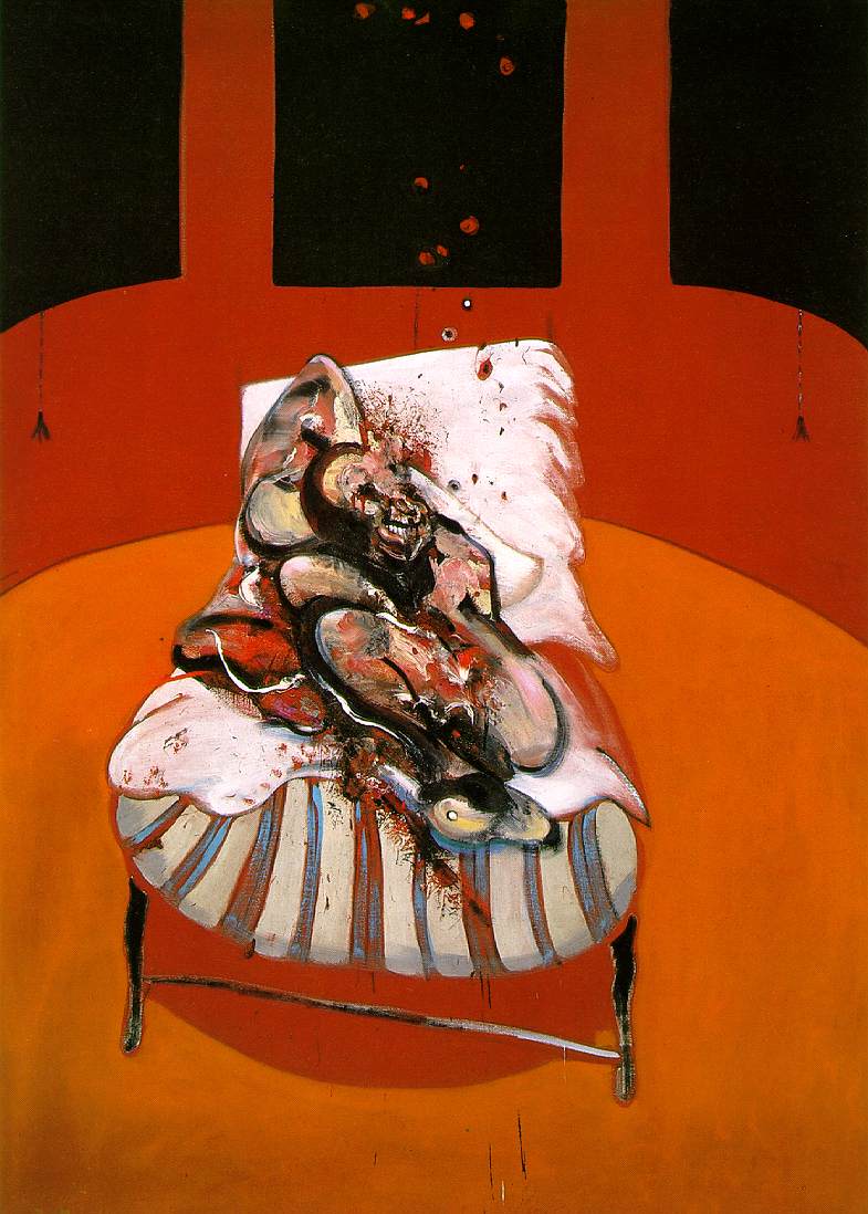
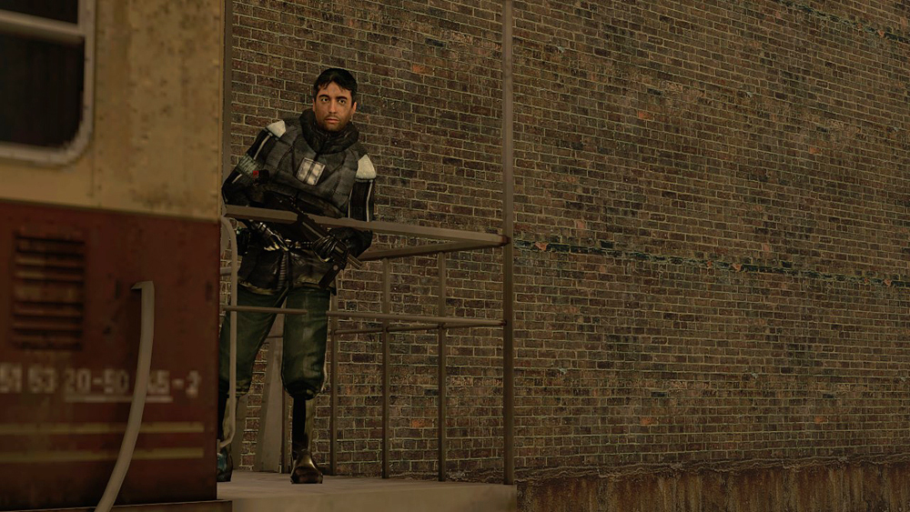
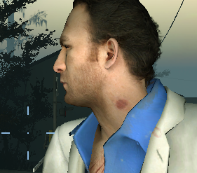
Faces
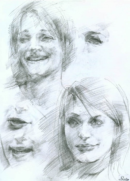
Takayoshi Sato, character artist and FMV director for Silent Hills 1 and 2, has made the case for subtle and unmistakable visages, whether that be the likeness of an existing human reference or a made-up composite of features.
Crucially, he makes a clear distinction between the cosmetic / shape language aspects of a character, which can be concepted without having chosen (or Frankensteined) a specific actor, and the more emotional, subtextual details observable in that actor's unique phenotype.
"In approved concept art, we usually see fantastic costumes, accessories, and cool tattoos. But the drawing of the human itself often remains a stereotypical archetype. This is understandable because first, the characters' actual roles in games tend to be stereotypical, and second, it's not usually the concept artist's job to delineate the nuance of the human inside the combat armor... What makes a human character human is those non-visual language elements."
Here, in intensely considered facial features and their convoluted expressions, actors can convey conflicting emotions, uncertain responses, that most powerful of narrative tools—irony.
 |
| Silent Hill 2, 2001 |
This kind of subtlety is hard enough to achieve with a real actor as a reference. What of trying to invent a new human altogether? Sato warns:
"The typical way to design a human is to pick stamps of features from many people and combine them like a police composite drawing. It usually takes a hell of an effort to blend them so that all parts and skull shapes work in harmony, and even then there is no guarantee that your results will look strong."
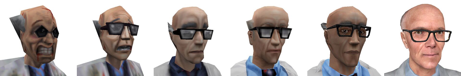
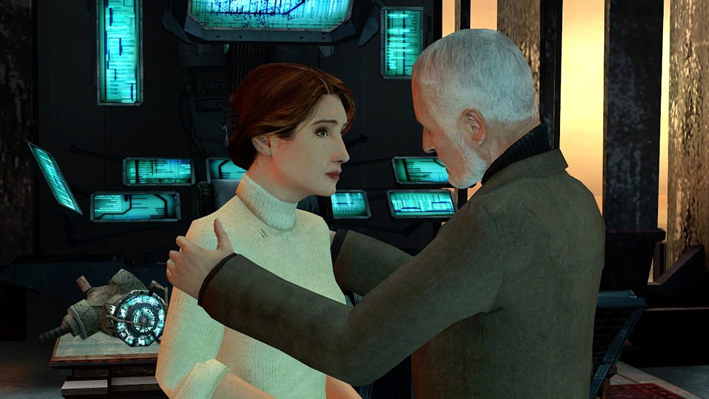
I believe it is possible to draft an original human face. I've done it before. AI can do it too. By all means, though, use real people, if possible. Dr. Kleiner, Barney, and Judith Mossman to this day read as actual people—in typical sci-fi roles, yeah—your classic ditzy scientist, etc.—but transcending those stereotypes through shrewd casting and sheer candid adult human impression. Even the—you'd think—flimsy trifles in Left 4 Dead 2 are treated by Valve to the dignity of believably human draftsmanship, not to mention some charming makeup work—check out the hickey on Nick.
This sort of ties into my spiel about the graphic signature of a 2D texture. While I'm interested to see advances in convoluted facial geometry—pursed lips, crow's feet, flared nostrils—this is all secondary to, and maybe even in contention with, what's really critical for achieving eidetic recognition: an animated diffuse texture.
Certain graphics practitioners and researchers, like John Hable, contend that somehow, for whatever reason, this superficial color information does the lion's share of the work in convincing our brain that what we're seeing is a living person. I'm not sure how firmly I believe in the existence of the uncanny valley, at least in a strict sense, but I'm totally on board with animated diffuse maps as a potent answer to it.


 |
Siren, 2003 |
Besides, there's different kinds of "uncanny." Siren for the PS2, also called Forbidden Siren, has some of my favorite faces in the medium. They look projection mapped onto the models as if by an actual projector, like a Tony Oursler piece, running at a rather low framerate. They're disquieting, they're uncanny, but precisely because they so unmistakably represent actual Japanese people. And even though they feel a little "off," they're off in the right ways and not the wrong ways.
You may have noticed by now that many of my examples have been from horror games. I think this is partly because of the kinds of intimate scenarios they tend to focus on but also because they have extra license to juxtapose representational styles—to be inconsistent—and to generally adopt many of the habits of the art production of the avant-garde.
The proof is in the performance. There's no magic bullet, beautiful results really come down to giving artists the time, project stability, and executive access to sincerely realize a realistic character, but games like Siren demonstrate that certain methods for capturing facial information can result in a genuinely affecting portrayal (never mind the preposterous English voices). Also, can I just say I love the design for Naoko. Great design for a playable character, honestly.
 |
| Stefan Hirsch, Portrait of an African-American Man, approx. 1930 (left), Lucian Freud, Boy Smoking, 1950 (right) |
Keratin
Hair is hard. So are teeth. How should real-time artists approach them? I'm not sure.
To be honest, using good old cards or simple truncated rings for teeth would seem to gel with the flatter PS2-style approach I've been advocating. Probably best not to worry too much about how they'll accept shadows and highlights and all that. Though every once in a while, a sparkling canine can pack a punch.
 |
Jak 3, 2004 |
Hair, though. It's better than it was! Facial hair especially has had a tendency to look like magnetized powder: scratchy, noisy, aliased to hell, a mess of sub-pixel triangles with little sense of overall conformity. AAA developers keep chipping away at the attempt to render hair as a bundle of individual strands or curls. In some cases, hair might be worth splurging on, for example to create an afro. Most often, though, a sculpt with a nice sense of body and orientation, and a few bones here and there for bouncing buns and swaying curtains, would seem to do the trick. And even though I'd take the beveled action figure mold over the jaggy crisscross of cards 8.5 times out of 10, it doesn't have to look like Sculpey.
 |
SpyParty, in development (left), Parmigianino, Madonna of the Rose, 1528 - 1530 (detail, right) |
Skin texture itself comes with its own baggage: questions of labor, expense, authenticity, and stigma abound. Who gets to have dirty, oily, porous skin? Etc. Although high-resolution skin detail would probably generally conflict with the cel shading championed earlier, I imagine there might be a certain amount of wiggle room, especially if faces are being handled as a relatively flat projection.
 |
Death Stranding, 2019 |
Puppetry
Fitting dentures, dressing a coiffure, underpainting blood vessels—this is all well and good, but what really counts when silicone rubber meets thumb is how the thing moves.
Traditionally, the main tradeoff game animators have had to make is between responsiveness and fluidity. The less obviously and immediately a character's movements follow from a player's inputs, the more latency, resulting in an often undesirable "floaty" feel, which can put the player at a further psychic remove from the avatar they're piloting.
 |
| Pinocchio, 1940 |
Motion capture has been the primary driver of real-time 3D character animations for some time now. Unfortunately, reliance on mo-cap for player-character actions often contributes to such delayed and imprecise feedback; further, it tends to lack the focused exaggeration and demiurgic wit of hand-posed key frames. I admire the work studios like Naughty Dog have done on blending individual animations—their new "motion matching" system used in The Last of Us Part II chops a huge library of captured movements into tiny pieces (sometimes individual frames) that it can then stitch together on the fly for seamless transitions from one action to another that convincingly reinforce the fiction of high-adrenaline improvisation. It all plays out in a way that looks scripted to a T. But that's Naughty Dog. Their "real" is an ideal I don't subscribe to.
(Side note: while I concur with much of the thrust of Michael Thomsen's essay, especially the plausible deniability and skeptical phenomenology of hyperreal violence worlds, Digital Foundry's explicit project of demystifying graphics tech from a reverse engineering/enthusiast perspective seems like a poor target to attack—though I do cringe when they describe some presentations as "better").
Many of the most pernicious issues in animation come down to scope. Motion capture is pretty much the only way you're going to animate hundreds of NPCs. Even if you're not, it has its place, even if just to provide reference data. But the animations I cherish don't tend to have a million frames or strictly "correct" kinematics. Wander's gawky, desperate run cycle in the original Shadow of the Colossus, or his lunging, unpracticed sword swing, have a characterful awkwardness to them but are rhythmic and discrete enough to effectively reason about as their agent.
 |
Dark Souls III, 2016 |
Aside from the so-called cinematic platformers and adventure games, there are some twitchy action games, like those released by From Software, which use delayed animations, making clever use of input buffers, wind-ups and fakeouts to compose these weird, etiolated combat patterns—perhaps best exemplified by the Dancer of the Boreal Valley in Dark Souls III or the Headless Ape in Sekiro—which lend the games' hack-n-slash gameplay a dose of balletic depth and their laconic adversaries a cave-aged eccentricity.
 |
| Kaiba, 2008 |
First-person animation. This is kind of a mixed bag for me.
It's been done well. Overwatch is bursting with bespoke animations for each hero, making use of some really clever "cheats" to squeeze a surprising amount of character into a first-person viewport. Breathing, fidgeting, saluting, hobbling on a peg leg—I may not care for the character designs themselves, but the attention to detail here sells each personality beautifully. And I'm sure that counts for a lot when your avatar isn't a cipher but a strongly defined role chosen for its zesty attributes: costume, poses, weapon arts, one-liners.
There's also some subtler examples of effective first-person animation. The critters used as ammo on your crossbow in Oddworld: Stranger's Wrath. Your hand automatically reaching toward and latching onto handles in Return of the Obra Dinn is a really nice touch. I remember enjoying the spear handling in Peter Jackson's King Kong too. And let's not forget the glorious visor effects of Metroid Prime.
 |
Return of the Obra Dinn, 2018 |
I'm forced to reflect on two early scenes from Half-Life 2, though. There's the famous "put the can in the trash" gag, which a Metro cop snarls at you, blocking passage through a gate in the train station until you either comply or throw it in his face. Then there's your first rendezvous with Alyx: there's a short stairway leading down from a platform with a rail, which she casually opts to swing over. You can either trudge down the stairs or effectively follow her lead, jumping up onto and then down over the rail. Neither choice is remarked on or accounted for in any significant way, nor is either given an actual animation: you don't gingerly drop the can in the receptacle, you don't whip the can at the cop's mug with a twist of the wrist or a pitcher's wind-up. No arms grab the rail to vault your body over. And that's the way I like it. It doesn't take me out of it. My sense of personal agency has never been more intact. Call me naive, but I believe there's still a place for the player's imagination in character-based 3D gaming.
That being said, the things animators do with IK, or inverse kinematics, these days is really something else. Especially for third-person control schemes, intelligent foot and hand placement, leaning, contorting, compressing, gripping, dynamically adjusting body positioning to pass through metrically irregular environments: it's magical stuff. Death Stranding takes on the Goliath of intricate traversal of bumpy, complex terrain, where you plan your route, shift your weight, slalom through mineral deposits—it's practically the whole game. It's not always perfect, but it's certainly... thick.
There's much, much more to talk about when it comes to character animation in games. But I thought I'd just leave off here with a nod to the concept of elegance. Reusing the same animation for multiple contexts, simplifying interaction cues, omitting an animation altogether—these choices don't just save on production costs, but, assuming you're making the sort of tradeoffs that support your project's key experiential goals, can add a sense of consistency and ingenuity which players are more keen to appreciate than you might realize.
 |
| Charles Fréger, Untitled, from the series "Yokainoshima", 2013 - 2015 (left), Untitled, from the series "Itza'", 2004 (right) |
Peeves
- Characters coterminous with backdrops
- "Easy," twee shorthand: tapered cone legs, minimalist geometric decals, Journey
- Bland and indistinct faces; cosmetic character design with casting as an afterthought
- Fussy, creepy stamping of peach fuzz, pores, blood vessels, etc.
- Mesh deformation without updates to the diffuse
- Facial expressions lacking subtext, interiority, irony
- Noisy, jaggy hair
- Careless treatment of dark skin tones
- High-fidelity, high-latency motion capture; look over feel
- Player-character animations, especially first-person animations, which leave no room for interpretation
- Stiff or over-articulated lip sync with weak punctuation of accent syllables
- First-person head bob
Preferences
- Outline-less, undogmatic "cel" shading: incandescent "pop," discrete color shifts to indicate material, sensitive adjustment of vertex normals
- Well-defined, subtle faces with their own eidetic imprint
- Projection mapped low-ish framerate (with motion blur smoothing) facial animation a la Siren
- Animated diffuse textures on faces
- Canny casting which transcends stereotypes
- Sculpted (but not Sculpey) hair which prioritizes conformity, shape, and fringed wave "smear" (or grooved braid/curl) effect over forest of individual strand/curl cards
- Hand-posed key frames + math interpolation + IK
- Rhythmic, low framecount animation cycles—lower framerate to animations overall, with game itself running at 60 fps+
- Simplified, elastic, accent syllable-emphasizing lip sync drawing on best practices from traditional animation
- Brazen economy of animation solutions
Things to consider
- Self-shadowing
- Idle animation
- Shape language and stereotypes
- Secondary motion
- Spring and dampen; anticipation and settling
- Overshoot
- Hitstop
- Blendshapes
- Flinches
- Eye direction, blinking, saccades
- Input-triggered fidgets (as with the heirlooms in Apex Legends)
- Makeup
- Bloodflow
- Normal or displacement map of detail from high poly mesh slapped onto lower poly mesh
- Masks: codified, discrete, artificial, symbolic, selectable faces
- Quadrupeds
- Apes and monkeys
 |
Peter Jackson's King Kong: The Official Game of the Movie, 2005 |
Environments
The elephant in the room is all over it: you're walking on it, staring up at it, even hiding amongst it—
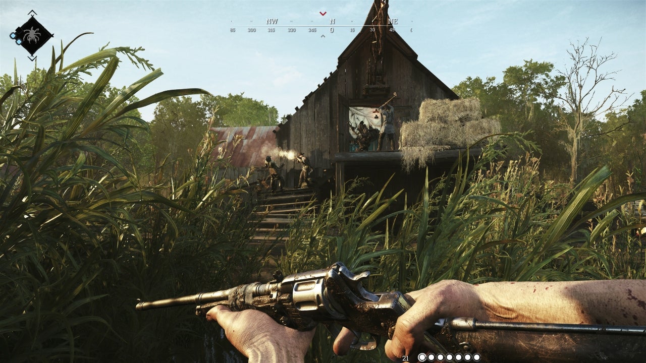
Foliage
A notoriously hard problem in real-time rendering, with seemingly no consensus reached on best practices. I mean think about it: your renderer is drawing a frame—some hills, logs, a rock outcropping, okay, and then suddenly, passing over these relatively sensible meshes, it runs into some hellish tangle of crosscutting quads and jutting triangles, and what—each one is supposed to cast a shadow on the other? and scatter sunlight through its translucent leaves, which by the way are waving in the wind? This is ridiculous!
Like hair, foliage is a familiar and hard to do without feature that happens to be quite difficult to represent in a simulative way. And, like with hair, I don't quite have a picture in mind of a "general purpose" solution to advocate. Middleware like SpeedTree offers some pretty robust solutions, and the implementations in a number of recent titles have been pretty convincing, but I've also seen examples of custom phytopoesis informed by landscape painting and holistic design that have struck perhaps an even more sympathetic cord. I wonder...
 |
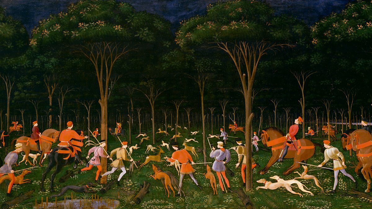
| Paul Bril, The Stag Hunt, 1595 |
 |
Baldur's Gate, 1998 |
It might be useful to break the vegetation of a given biome, such as a forest, down into a few distinct categories: carpet, canopy, colonnade, brush, and fruit. Hopefully this kind of artificial separation of features can help us think about how we want to compose a vegetation-heavy scene, and what impression we want each feature to contribute.
For example:
Carpet—arrangement of detritus against soil snaked through with undergrowth; a jazzy arabesque in orange, purple and green.
Canopy—maybe tree crowns look like broccoli, or like they do via Google Earth; maybe they're solid polyhedra wrapped with scintillating noise textures.
Colonnade—a hypostyle slalom course in atmospheric perspective.
Brush—fractal ferns, voxel mimosa.
Fruit—quincunx-engraved cones and bump-and-cavity-mapped quinces.
Such attempts to architect a more "legible" outdoor environment go hand in hand with that old refrain: artistic LoDs. Though generally I've been suggesting that environments receive greater detail and texture than the actors moving through them, foliage is also perhaps the area that could benefit the most from a decorative flair. After all, so much of our collective typology of "abstract" and decorative motifs is drawn directly from the observation of plant forms. The way that shapes and patterns of the forest carpet, the canopy etc. morph, simplify or fill in as the camera changes distance or pitch could give such environments a sort of breathing, multi-tier accordion portfolio of textures that could handsomely bridge the organic and the artificial. Most games try to make their level-of-detail transitions invisible, but that just means when you catch one it looks unintentional. On the cylindrical island of Animal Crossing: New Horizons, triangles of grass stick up on the horizon, but get flattened down parallel to the cylinder when it scrolls. What other transitions are possible? Maybe procedural textures using something like Voronoi math?
Even here though, I want to see uneven distributions of obsessiveness. Would we cherish the work of Samuel Palmer if he cared for every surface as much as he cared for fluffy blooms? Plants have a funny ability to appear soothing at a distance and disturbing when closely observed. Which species "pop" and strain with biological gusto can even help sketch the psychological profile of our player-operated wanderer.
 |
| Samuel Palmer, A Cow Lodge with a Mossy Roof, 1829 |
 |
| David Hockney, Under the Trees, Bigger, 2010 |
Atmosphere
Earlier I'd mentioned the overcast skies in Half-Life 2. In 2004, those were skyboxes: more or less static cubemaps. Many games since have featured dynamic time-of-day and day-night cycles, cloud cover, fog, rain and lightning. In games like Grand Theft Auto IV, the indifference of such dynamics helped stage some of the most memorable moments I had playing them, sometimes ironic, always dramatic. They can add some drama to gameplay too, like lightning striking metal or Link's grip slipping in the rain in Breath of the Wild.
On the subject of LoDs, it's interesting to see how Shadow of the Colossus streams its environments on PS2. You've got full geometry when near, which reduces to a simplified mesh when farther, which then at the farthest distance becomes a soft-focus billboard; transitions from one level to another happen with an effect like dispersing a veil of glaucous fog.
 |
| Ian MacLarty, Southbank Portrait, 2015 |
I don't have many complaints with recent advances and trends in sky rendering. It's good stuff! All I would advise, aside from not binging on crepuscular volumetric smog all the time, is to respect and fear the emotional power the vault of heaven provides. It's really the only thing you need to change to make it feel like you're on another planet.
For nighttime I would say: the moon is not that big, come on, tone it down. Also look at those diffuse gas lamps and tungsten bulbs in Red Dead Redemption 2 I mean god damn.
 |
Red Dead Redemption 2, 2018 |
Interiors
No big ideas (at least none within the (already ill-defined) scope of this essay), just some stray notions:
- Paneling
- Parquetry
- Blind corners
- Wallpaper
- Crown moldings & base boards
- Lamps
- Class-inflected composition, as in the films of Lucrecia Martel
- Third person out-of-doors, first-person in-of-doors?
- SpyParty's wall-culling third-person camera
 |
| P.T., 2014 |
Peeves
- That "middleware" look
- High fidelity, low sensitivity (re: plants)
- Bashful LoD transitions
- Moon that takes up half the sky
Preferences
- Artificial/architectural approach to biome's multi-axis visual "package"
- Arts and Crafts-y "wallpaper" design sensibility for foliate patterning
- "Accordion portfolio" of artistic LoD transitions—see David Hockney's large landscape canvases
- Phytological favoritism
- Strong attention to light fixtures: placement, cover, temperature, volumetric diffusion
- Mix of artificial and natural light sources in semi-open interiors
 |
| Hereditary, 2018 |
Props & UI
In character-based graphical gaming, your character's chosen tools are often the primary means by which you express your agency in the world, and the verbs and adverbs afforded by them often carry the genius—the "gimmicks"—of the game itself. Thus it's critical that the tools your character is using be distinctive and robust.
Digging deep into principles of great prop design is again a bit outside the scope of this essay, though you could pretend I started this segment rattling off some platitudes about research, kitbashing, such and such, and the other thing. Instead, I thought I'd first highlight a few favorite examples and then give some thought to feedback, cues and indicators, interfaces and things like that.
Poignant apparatus
Disco Elysium makes up for its lack of real-time dynamics with its literary tenderness. Every item you collect has a story, and perhaps more importantly, a smell. The production's painterly style—colorful yet dreary—is most successful in these rhopographic portraits, and they provide a great opportunity for the writers to flex their technological imagination: filament memory, ceramic armor, apricot-flavored chewing gum.
 |
Disco Elysium, 2019 |
Another recent title with an unusually spry technological imagination is Death Stranding. Yoji Shinkawa really outdid himself this time: the techwear and utility gear is to die for. The most fascinating "equipment," though, is the most alive: your odradek and your BB. The former is this sort of quacking stellate scanner—named after an enigma in a Franz Kafka story (amazing)—that swivels and spins to track the generally invisible "BTs." The latter is a literal baby. It cries when you trip and fall and you can calm it down by rocking its artificial womb with your controller's motion sensors.
In a previous Kojima joint, the magisterial Metal Gear Solid 3, you face off with a camouflaged sniper in a large, dense forest. To my mind the apogee of single-player electronic gaming, this tense yet sumptuously open-ended battle has you pulling out every gadget in your arsenal. But the one that really comes in clutch is the directional microphone. Equip this bit of Cold War era tech and you snap into first-person, training the mic on distant rustles and bird calls until you hear the snoring of your ancient adversary coming through the chunky headphones.
 |
Grow Home, 2015 |
I'm just gonna shout out some other favorites:
- The rope arrows from Thief
- The Container of Knowledge from Pikmin 2
- Adjudicator's Shield from Demon's Souls
- Robert's Firecrackers from Sekiro
- The airboat from Half-Life 2
- The health stations from Half-Life: Alyx
- The mop from Viscera Cleanup Detail
- The Yosemite hammer from Getting Over It
- The Space Jump Boots from Metroid Prime
- The trident from Power Stone 2
- The Fall Flower from Grow Home
- The Bienjensu Stella Rage 850 hacking deck from Quadrilateral Cowboy
 |
Pikmin 2, 2004 |
Feedback
The Yosemite hammer bends a little. The Fall Flower loses petals. I like it when objects convey state in their own little animistic idiom.
Besides providing your player-character with basic verbs, props also frequently exist to express a game's physics and chemistry systems. Improvised cover, banknote confetti, splintering crates: physics simulation can add a lot of flair and dynamism. What really tickles me though are physics materials on surfaces, never better expressed than in Getting Over It with Bennett Foddy. Slippery ice is the most common example of the idea, but there are many other possible surfaces that vary in roughness, elasticity, cavity, etc. Friction and bounce are two ways these qualities can come through, but this is really the foley's time to shine.
Yes, this article is about graphics, but really, when it comes down to it, it's all about UX. And so I feel I must give a nod to sound design, which complements the visual package. The double-fisting of high-fidelity audio and high-fidelity video in AAA titles is a bit redundant and boring. Rich audio can do so much to fill in for more impoverished or abstract visuals. Not dissing the graphics in Michael Brough's games, I love them, they're fantastic, but it's the guitar strum SFX in Imbroglio and dubby mumbled chirps in 868-HACK that make playing these lo-fi enigmas feel both otherworldly and luxurious.
I mentioned chemistry systems before though. Substances reacting to catalysts and turning things into other things, in other words. Here again I feel Nintendo has its head on straight. In Breath of the Wild, when you chop down a tree, it becomes a log. Chop up the log, it becomes firewood. Set fire to the firewood? A bonfire. Each time with a little poof. There's more sophisticated systems as well, like the fire propagation, but to the player they're just as obvious. I guess what I'm arguing is you can do cartoon logic "cheats" like these even in a more "serious" game and get away with it. Just have confidence. Resilient, not fragile.
 |
Getting Over It with Bennett Foddy, 2017 |
Rendering
So we've talked about characters and environments. What visual style would I recommend for props? I think for your key items—weapons, gadgets, mission-critical baubles—this is where your artists can really nerd out with fancy materials and fussy geometry. I'd still prefer kind of bald designs for most of these—less "I could never come up with that," more "that's so stupid, why didn't I come up with that"—but for the render itself, sure, go crazy. It's only once you're indulging this level of asset creation for every bit of incidental junk—i.e. outsourcing it—that you've got a problem.
Frob FX
There's more to prop UX than the design of the object itself and its sound effects. There's also the ways it communicates that it can be interacted with in the first place. As always, we should challenge our assumptions about what these effects—frobs, handles, cues, whatever you want to call them—look like, so here are some possibilities:
- Outline / halo
- Tinted highlight wrap or animated overlay
- Actor IK, e.g. hand reaching out
- High contrast against environment, e.g. independently lit, or spotlit
- Full geometry vs. flat texture, e.g. operable door's handle is modeled while ornamental door's is flush with rest of door texture
- Idle animation, e.g. door handle periodically rattles
- Haptic response, e.g. controller vibrates as you approach
- Standard size and/or shape and/or color
- Floating identification label
- Floating or HUD-space input or contextual action prompt
- Contextual cursor/reticle icon
 |
| Paratopic, 2018 |
Inventory
- 3D object viewers are nice
- Snap rotating to an object's faces in a viewer generally feels better and is more realistic than slowly rotating it by degrees
- Object portraits > icons
- Contiguous grid, or grid sectioned off into containers, or carousel, or list
- Frame corners for selection, or alter tile background, or enlarge selected object
- Item shape & orientation Tetris
- Character portrait
- Sidebar or other window which shares real estate with main scene frame
- Destiny's analog cursor with hover easing/friction and counter-panning background
- Metal Gear Solid 3's X-ray medical viewer and films of Snake dressing a wound
- Purple Noise Echo's austere config menu
- The Norwood Suite's funky but functional "L.L.Spleen" bag
- Pathologic 2's separate pockets which can be enlarged with sewing thread
- Sam's private room in Death Stranding
- Wilmot's warehouse in Wilmot's Warehouse
- The Save Room in Uurnog Uurnlimited
- The dungeon floor in Imbroglio
 |
The Norwood Suite, 2017 |
Menus
- Orthogonal or radial
- Tabs
- Breadcrumb trail i.e. navigation path/layer index
- Pointer: arrow, circle, severed hand
- Fitt's law
- The organ SFX from old survival horror games
- Killer7
- Super Smash Bros. Ultimate
 |
| Killer7, 2005 |
Text
- Vertical sidebar dialogue feed
- Bottom centered dialogue box
- Subtitles floating over speaker in 3D space (can display at bottom of screen with directional arrow when speaker is offscreen)
- Font from The Witness: large, handsome serif with crisp drop shadow
- Subtitles two lines high max
- Speaker indication
- Animated emphasis on dialogue text (can get annoying fast)
 |
The Witness, 2016 |
HUD
- Reticle—shape e.g. cross, circle, brackets; opacity; (variable) size
- Minimap—angle; telescopic (scales according to travel speed)
- Compass—Elder Scrolls style at the top of the screen marked with points of interest; Love style icons rotating toward points of interest
- Threat indication—stereo mix & attenuation; adrenaline effect; increased FOV; odradek from Death Stranding; threat ring from Metal Gear Solid 4; radio static from Silent Hill
- General presentation—opacity; skeuomorphism; window frames; letterbox matting; non-parallel window edges; chromatic aberration; stereoscopic depth offset
 |
| Quel Solaar, Love, 2006 |
Peeves
- Literal / redundant sound design / foley
- Booming stereo mix with narrow range and little negative space
- Incidental physics pyrotechnics with diminishing returns on impact
- Chemistry systems that prioritize tedious "realism" over lucid, snappy logic
- "Star" level detail and finish applied to hundreds of incidental props
- Elaborate "portfolio piece" prop designs that obscure a prop's essential anatomical idea
- Mirror's Edge style color coding within noncommittal art direction
- Abundance of floating identification labels
- Tiny flavorless icons everywhere, especially for in-fiction objects like equipment
- Voiceover cues
- Tautological combination of every affordance/ID indicator available, e.g. color coding and label and audio cue and spotlight etc.
- Ironsights AKA aim-down-sights
- Slowly rotating held objects
- Analog cursor selection on gamepad without highly engineered easing curves, counter-panning background etc.
- Object handling / inventory mechanics that are so slow and awkward as to make player-character feel inappropriately lacking in dexterity
- Tiny fonts
- Precious animation on dialogue text for emphasis
- Most pixel fonts in general—check out loren schmidt's gelatin mono for a good example of a low-res font: monospaced mixed serif with just enough anti-aliasing
- Large, opaque reticle, especially Bioshock style circle
- Minimap
- Bullet trails à la Uncharted
- Screen turning red or draining saturation and/or blood splatter effect to indicate damage
- Cluttered, scene-obscuring, always-on HUD
Preferences
- Versatile, witty props which communicate state in their own thematic visual design
- Tactile, richly foleyed physics materials on surfaces
- Musical ear toward sound design which truly complements—as in completes—the visual design for a deeply synesthetic feedback suite
- Simple, consistent chemistry transformations
- High material artifice on "hero" tools and props
- SpyParty-style outlined regions which change context i.e. list of available actions
- Snap rotate along faces of object in viewer
- Inventory represented with fictional justification but still abstracted enough to benefit ease-of-use
- "Inventory" integrated into environment itself
- Creative non-diegetic SFX for menu navigation & selection
- Large (serif) fonts, especially for subtitles
- Faint glow on text
- Hieroglyphic hand-drawn icons à la Cinco Paus
- Button to toggle object labels (and other non-diegetic UI elements—kudos to the d-pad + face button toggle command in Red Dead Redemption 2)
- Creative but unobtrusive "sixth sense" threat indication solutions
- Chromatic fringing on neutral UI element edges
- Stereoscopic depth offset to screenspace HUD/UI elements... on a 3D display
 |
Pathologic 2, 2019 |
VFX, virtual cameras, etc.
Particle effects
Particle effects are a popular way for artists to make their games look fancy. I feel like Squaresoft popularized this. Magic spells are these baroque clockwork amalgams of doilies, sigils, and pulsating beams of candy-colored plasma.
You know what offensive magic plasma is? It's Greek fire. Just make it fire. Not every spell is Greek fire, though. Most magic should be invisible. Magic isn't just plasma. It's lore, it's secrets, tattoos, solemn wishes. If you want pyrotechnics, how about actual fireworks?
As for fire, though, this is one of those ubiquitous phenomena whose implementation betrays much about the overall art direction. From what I've seen, the kind of fire that feels most fire-like is a sort of papery, hard-edged flame effect with a stop-motion-y low framecount flicker and a narrow (but softly graduated) colored veil.
 |
Resident Evil 4, 2005 |
For most of this stuff, a little goes a long way. Blood is more disturbing when there's just a dribble of it.
Some other effects to think about:
- Hitsparks as actual sparks
- Ukiyo-e explosions and smoke à la The Wind Waker, or cel-shaded (i.e. two-color banded) smoke clouds without the helical inward curling, or opaque pale periwinkle clouds lit up orange from inside
- Extremely brief light-casting (and ambient light dimming?) muzzle flashes
- Morning dew and big fat tears
- Confetti
- Geysers, jets, snot and ejaculate
 |
Sekiro: Shadows Die Twice, 2019 |
Post-processing
Though discretion is as important here as anywhere else, I have a suspicion that the absence of post-processing in older 3D games was, along with bilinear texture filtering, the biggest culprit behind their often harsh, unseemly image. Really it's quite impressive what a sprinkling of anti-aliasing, motion blur, depth-of-field, and anisotropic filtering can add.
Other options include HDR, tone mapping, film grain, lens flare, bloom, vignetting, and diffraction filters / chromatic aberration. I'm not generally crazy about vignetting, except against the daytime sky, and certain lens artifacts like flares and dirt can look a bit goofy, but with the right default values (and in-game adjustment options), all of these algorithms are welcome. I think I've come around more on chromatic aberration especially (probably it was after listening to a lecture on Goethe's Theory of Colours): sometimes it can be headache-inducing but it can also sort of soften (but at the same time highlight) edges and give things a pleasantly subliminal spectral sheen—I'm especially fond of indigo fringing on whites.
 |
| John Singer Sargent, Corfu, 1909 |
 |
| Wayne Thiebaud, Deviled Eggs, 1962 |
I must admit I'm also pretty optimistic about AI processing on the GPU. Compression, supersampling, upscaling, and image reconstruction seem like they could see some really powerful improvements with the assistance of neural nets, in fact I think these kinds of algorithms are exactly what AI is good for. DLSS and variable rate shading and whatnot are mostly engineering solutions though, I don't think they'd have a ton of relevance to an art director.
Shaders, though. The sky's the limit. I couldn't even begin to list the possibilities, but let's just say we can get very psychedelic if we want to. And why shouldn't we?
I mentioned something like this in the earlier segment on color, but I've been thinking about the variations in intensity and the sort of pure/diluted versions of colors you get with actual pigments and dyes. I'd love to see more tone mapping and arbitrary tailorings of color space that attempt to capture this kind of chemical attenuation.
 |
| Increpare, Slave of God, 2012 |
 |
| NieR:Automata, 2017 |
Display media
With all this talk about supersampling this, chromatic aberration that, I'd be remiss not to at least mention the display technology itself.
Basically, my feeling is: were LCDs a mistake? Ignoring the size, weight, and manufacturing/logistical problems associated with them, CRTs, especially aperture grille CRTs like Sony's Trinitron series, have some considerable advantages: true blacks, soft falloff, a wider viewing angle, beautiful color reproduction, absence of motion blur, arbitrary resolution, and just a more analog, natural but also kind of otherworldly phosphorescent look. Running a game at 60+ fps on an aperture grille CRT with a clean video signal and a high refresh rate—that's deluxe.
My misgivings on this matter led me down the blind alley of SED and FED TVs, a promising technology tragically aborted in the mid-to-late 2000s, just as LCDs began to take over the market. Surface-conduction electron emitter and field-emission displays seemed to combine the best of CRTs and LCDs: flat and thin but with fast response times, no blur, wide viewing angles, and strong contrast ratios. Apparently each pixel would have been comprised of RGB sub-pixels cast by a matrix of miniature cathode ray tubes. They even consumed less power than LCDs at the time. Unfortunately the only demo I could find was 360p handcam footage from CES 2006. What could have been...
Anyway, OLEDs and QLEDs are nice I suppose. Hopefully they'll be more affordable soon. But really there are many media formats through which one could theoretically display real-time video:
- Ultrawide
- TATE mode
- Stereo HMD
- Multi-panel
- LED matrix
- ELD
- Low-power (monochrome / un-backlit) LCD
- Vapor holography
- Mirror holography
- Volumetric holography
- DLP projection
- Geometry-mapped projection
- Near-field laser projection
- Eidophor projection??
 |
| Ian Cheng, BOB (Bag Of Beliefs), 2018 - 2019 |
Optical phenomena & alternative rendering
Most 3D engines construct objects out of triangles, and most virtual cameras project objects onto the frame in linear perspective. But there are alternatives.
Voxels, froxels(?), Voronoi cells, signed distance fields, particle clouds, metaballs / implicit surfaces, "splats" or what Media Molecule's BubbleBath engine calls "flecks," and of course good old raytracing are all potential building blocks for rendering that diverge from your typical polygons.
Scene projection is seeing some disruptive R&D too. I'm especially interested in techniques like FOVO which emulate aspects of the human visual system and that increase the field of view without necessitating an ultrawide aspect ratio or inducing the extreme receding effect you'd get with degrees greater than 120 in common linear perspective. Curvilinear perspective / Panini projection makes sense for mimicking human vision; after all, the retina is concave. Maybe this would make the most sense with a curved display and eye tracking-controlled foveated imaging using "lazy" variable rate shading? I'm not sure. By all means, though, give it a shot; even if it's not perfectly natural, I'm game.
I also wonder if there's not untapped potential in the kind of scene construction/projection used in 360° panorama software like Google Street View. Photogrammetry itself has clearly made inroads into traditional 3D workflows, but I'm kind of fascinated by the structure of the image stitching in something like Street View: floor, curtains, canopy, even the navigation GUI—to be honest, not that different from the parabolic "teleport" navigation in Obduction or Half-Life: Alyx.
 |
Half-Life: Alyx, 2020 |
Various other phenomena I'd be interested to see more takes on:
- Schlieren
- Scotoma
- Allergies
- Hyperarousal
- Caustics
- Tyndall scattering
- Corona
- Anisotropic shearing/tearing/splitting
- Turbulence
- Mesh relaxation
- Thin-film interference
- Photoelasticity
- Saccadic masking / transaccadic memory
 |
| Heinz Mack, Silberrelief, 1965 - 1967 |
 |
Anodyne 2: Return to Dust, 2019 |
 |
The Master, 2012 |
 |
The Last Guardian, 2016 |
Peeves
- Wind direction indicated by visible streaks
- Magic spells as abstract spatial liquid crystal pyro-paintings
- Wimpy fire
- Viscous burgundy specular mapped blood splatters
- Thin, quick-to-dissipate smoke that doesn't receive light
- Heavy motion blur on camera movement
- Noticeable vignetting—might be good for screenshots, but not as much for gameplay, and doesn't really simulate peripheral vision
- LCD TVs
Preferences
- Respect for the invisible
- VFX inspired by look & feel of stop motion
- Bluish smoke with body and turbulence
- Actual fireworks
- Temporal anti-aliasing
- Per-object motion blur
- Just a smidgen of bokeh depth-of-field
- Anisotropic filtering
- Soft diffraction filter: not as "glitch" effect but to give whites and neutrals a subtle spectral activity
- Grain filter of some sort? Doesn't have to be strictly filmic—what about a grain noise based on cellular automata, or neural compression artifacts?
- Wacky shaders
- Idiosyncratic color engineering
- Robust accessability options e.g. filters for color blindness
- Trinitron CRT with high refresh rate
- Rich combination of rendering approaches
- Panini / wide-angle curvilinear projection with (object-enlarging) focal distortion—basically, projection that emulates human vision
- Experimentation with basic scene construction and navigation—exporting ideas from VR to non-VR 3D
- "Sixth sense" simulation
- Anisotropy
 |
Metroid Prime, 2002 |
Final thoughts
I'm aware I might sound a bit like Ezra Pound recommending Noh. It's not that I'm trying to prescribe a total formula for an honest medium or something like that. On the contrary. I want game artists to question their assumptions, to be sensitive and limber. Would all the suggestions I've made complement each other perfectly, or even make sense for any actual shippable project? I don't know. Hopefully I've offered some ideas that can help artists and directors decide how they want to interpret the various features that make up a 3D video game's visual package. And if nothing else, I hope this was a stimulating celebration of the wonderful illusions so many talented people have crafted.
 |
| Marcel Duchamp, Étant donnés, 1966 |