This essay cannibalizes material from my earlier, much more scattershot "Preferences and proposals for real-time 3D imagery."
3D games, especially those with a non-fixed camera, typically have some sort of level-of-detail (LOD) solution in their rendering pipeline. That can include mipmaps (progressively lower resolution versions of a similar texture), progressive meshes, billboards and imposters (basically 2D “fakes”), distance fog, and virtualization or streaming of texture and even geometry data as in Unreal Engine 5’s Nanite system.
What I’d like to propose is the use of level-of-detail solutions not only for reducing aliasing and performance overhead but also for artistic effect. Often LOD solutions are judged on their invisibility — any noticeable artifacts such as popping are considered undesirable, and substitutions between assets of varying quality ideally would present the illusion of perfect continuity.
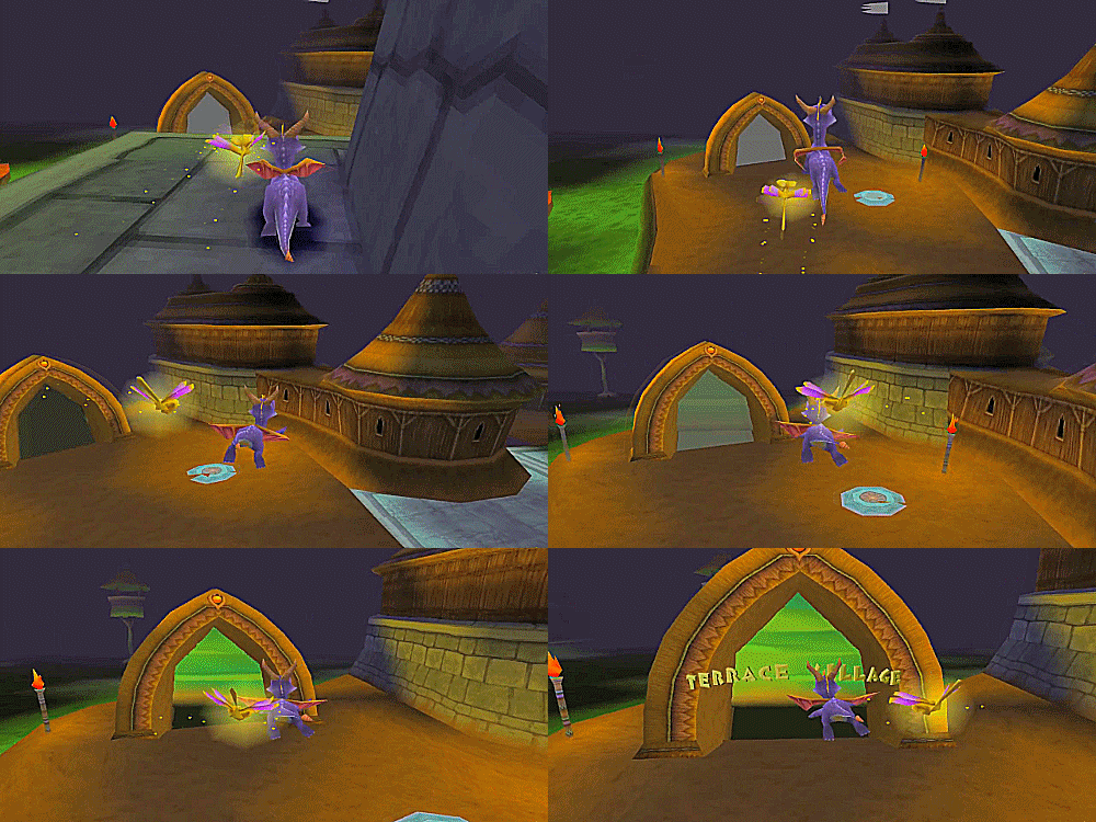 |
Spyro the Dragon, 1998 |
There are examples, though, if few, of games whose LOD solutions add their own aesthetic ideas to the overall presentation. I believe that studying such examples, and coming up with your own, can not only help make a ubiquitous class of techniques in real-time computer graphics emphatic rather than merely servile, but can also accentuate the distinct pleasures of real-time graphics in general.
The way I propose to think about a LOD system is as an “artistic codec.” Like a video codec (a format which encodes and decodes video data), a LOD system can be thought to compress visual information according to variable parameters. And by artistic codec, I mean those parameters can be adjusted for aesthetic ends.
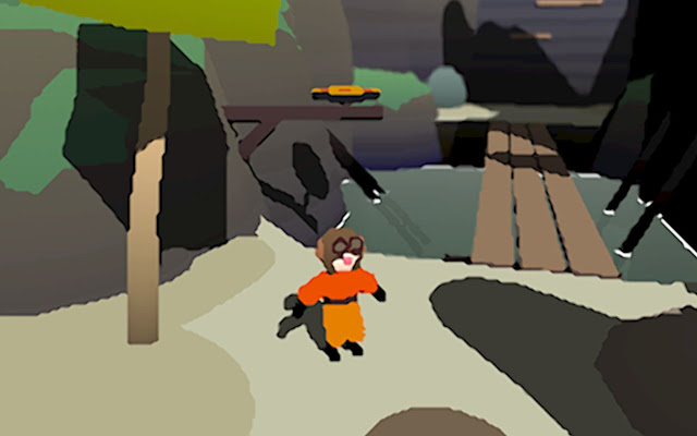 |
| Popo's Tower, 2020 |
The style of a distinctive painter could be said to be their compression algorithm: the unique tuning of weights and biases with which they simplify a given scene and present it as a picture — what they emphasize, what they collapse, how they manage and mix focal lengths, how they play favorites when choosing to convey different materials and optical phenomena. All of which is going to be informed by that painter’s references and influences — and rarely is a great painting’s total effect predicated on its fidelity to one overriding referent. Some of the most exciting plastic art, I would posit, is characterized by indeterminacy — the way the objects in a still life can seem to be painted from multiple viewpoints, at multiple slices of time, with varying levels of acuity, in different modes — sketchy, ornamental, sculptural, caricatured, trompe l’oeil.
Though there are obviously differences between the unchanging image of a painting and the constantly refreshing, dynamic and cybernetic image of game software rendering to a display, there are some worthwhile ideas from the former that can actually enhance the dynamism of the latter. Two notions I’d like to highlight are what I’ll call focalization and rhythm.
Focalization here means fluid, dynamic perspective — the virtual world and its details can be conveyed in multiple moods, so to speak, and we can even interpolate between these.
By rhythm I mean the variation in intensity across surfaces. How dense and intricate is the detailing of one texture next to its neighbors? And one neighborhood next to another?
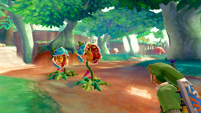 |
| Skyward Sword, 2011 |
Your level-of-detail system, with some ingenuity, can assist in managing these moods and cadences. It’s my opinion that many 3D games, by emulating one target referent (whether that’s photorealism or a “stylized” idiom like, say, ligne claire comics) and trying to render every component of a scene with the same apparent level of fidelity, inadvertently sacrifice contrast and depth and end up with what I would consider a flat, homogeneous image.
What I would advocate for, in concert with an art-directed LOD solution, is the use of multiple shaders and masking buffers to get a kind of mixed-referent or what I’d call a syncretic render. Take Breath of the Wild: each frame is a composite of up to 9 material mask layers — terrain, foliage, water, skin, hair, eyes, clothing and fur, metals, and rubber — each of which behaves differently at different distances and under different lighting conditions. Not only does this improve legibility for the player (both by differentiating kinds of objects and their physics properties and by reducing overall visual noise) but it also gives each material type its own charming reductive signature.
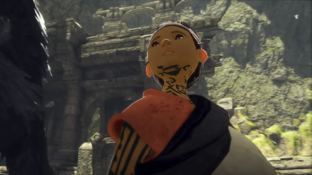 |
| The Last Guardian, 2016 |
Team Ico / genDESIGN take a similar approach with their rendering, as in 2016’s The Last Guardian. The boy’s flesh appears almost incandescent — its tone is consistently unmodulated, its shadows are consistently saturated, fancy disturbances in opacity such as subsurface scattering in the ears are reserved for extreme close-ups — and its callow beeswax evenness sticks out nicely against the setting’s intricate, weathered stonework and shimmering vegetable life.
A more extreme example of this kind of contrast can be found in Marvel’s Spider-Man, if the player has equipped the cel-shaded Spider-Clan suit. To my eyes this cartoonified costume makes the PBR surroundings way more convincing — sure, the picture takes on a bit of a Who Framed Roger Rabbit effect, but… so what? Leaving the eerie constructedness of the animation unresolved need not compromise the virtual world’s sense of presence and cohesion — after all, conventional notions of “immersion” are based on a fallacy which has little to do with the subtle processes of identification and alienation that go on in a player’s mind.
Getting back to LODs per se, though, this idea of heterogeneous compositing can be applied to detail-management techniques like mipmaps, to sometimes ingenious effect. With the rise of sophisticated shader technology, the manual insertion of mip levels has become something of a lost art. Nintendo was especially skilled at layering simple textures to create some really cheap yet lovely distance-based effects: check out how they did the water in Super Mario Sunshine.
 |
| Shadow of the Colossus, 2005 |
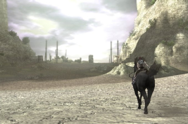
Another sixth generation game with some really interesting graphics tech (and another Team Ico title) is 2005’s Shadow of the Colossus. Streaming a large, open world in real-time on the PlayStation 2, distant objects transition from soft-focus billboard to simplified mesh to full geometry as the camera draws closer with an effect like dispersing a veil of glaucous fog.
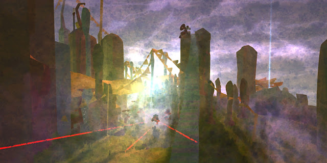
Post-processing effects like filters can also contribute to detail management. Two games that rely heavily on a painterly, impressionistic distance filter are Nintendo’s Skyward Sword and Eskil Steenberg’s MMOFPS Love. The extreme reduction in featural information at far distances makes similar solutions pretty much unfeasible if you need a high level of acuity for everything onscreen, but the sensation of bringing objects into focus as you move through the world is one of those primordial kinematic amusements video games can provide.
Which is the other point I wanted to make here. In addition to reducing performance overhead and in addition to helping manage visual hierarchies, aesthetically-minded level-of-detail systems can also enhance the sensation of parallax that is one of the basic pleasures of 3D gaming.
 |
| Love, 2010 |
I want to see games whose worlds “breathe” like an accordion: textures and decals filling in or bleeding together in a multi-tiered portfolio of expanding and collapsing detail, almost like a pop-up book. You don’t need to literally embrace a storybook or cutesy visual theme to justify this kind of visual artifice, either. Though while we’re on the subject, take a look at the way the grass blades in Animal Crossing: New Horizons turn from erect pennants to flattened terrazzo as the cylindrical world scrolls them away from the horizon.
Foliage is precisely the sort of big scary monster well-engineered LODs are poised to tame. A notoriously hard problem in real-time rendering, with seemingly no consensus reached on best practices, foliage practically demands thrift. I mean think about it: your renderer is drawing a frame — some hills, logs, a rock outcropping, okay, and then suddenly, passing over these relatively sensible meshes, it runs into some hellish tangle of crosscutting quads and jutting triangles, and what — each one is supposed to cast a shadow on the other? and scatter sunlight through its translucent leaves, which by the way are waving in the wind?
 |
| Paolo Uccello, The Hunt in the Forest, 1470 |
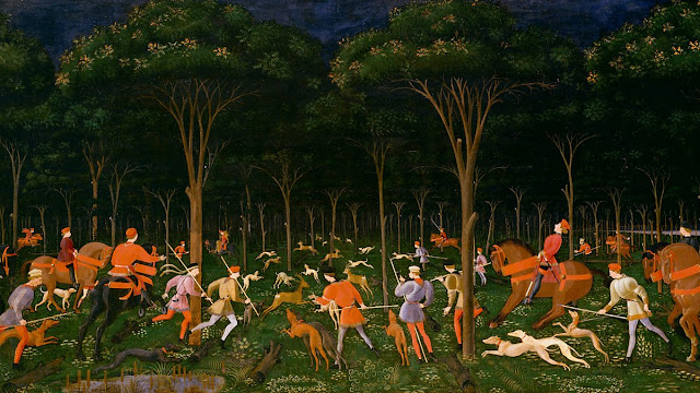
It could help to simplify a vegetation-dense scene such as a forest by breaking it down into a sort of vertically oriented typology which in ecology is called stratification: carpet, undergrowth, stem, fruit, canopy. Thinking of each of these genera as a nice chunky piece of the scenographic puzzle can help you decide how you want to individually style them, almost like styling an HTML tag with CSS.
For example:
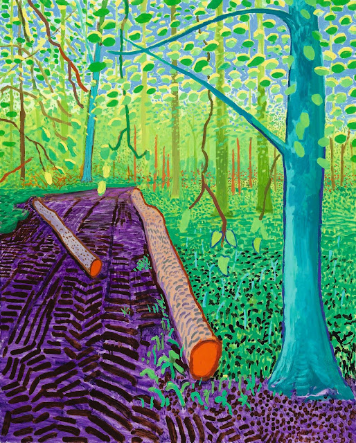
- Carpet: a jazzy arabesque of mottled purple soil littered with orange pine needles.
- Undergrowth: a jostling, self-shadowing crowd of stenciled leaf shapes studded with gradient-airbrushed low-poly flowers.
- Stem: a hypostyle hall in pronounced atmospheric perspective.
- Fruit: parallax-mapped cones and cavity-mapped quinces.
- Canopy: solid polyhedra wrapped with scintillating noise textures.
 |
| David Hockney, Astray, 2008 |
 |
| David Hockney, Under the Trees, Bigger, 2010 |
 |
| David Hockney, Queen Anne's Lace Near Kilham, 2010–2011 |
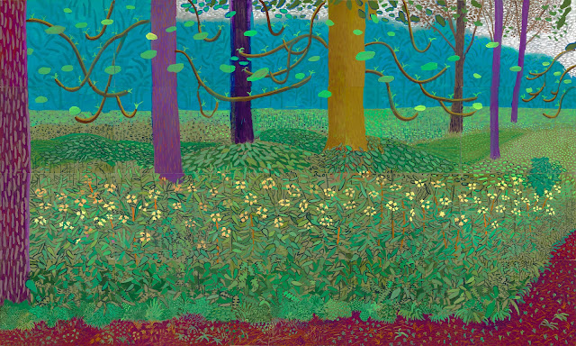
David Hockney’s large late canvases provide a valuable example of landscape art which marries ornamental abstraction with immersive, salubrious depth. Notice how the regions of plant life converge into more highly periodic patterns as they approach the horizon, how close observation feeds the fire of passionate exaggeration. Now imagine this all in motion — imagine sifting through these layers in real-time, watching as each oblong freckle on a tree trunk’s bark shrivels into a labyrinthine whorl, as the lines that defined the leaves of a bank of weeds bulge and scatter into a flocculent spray.
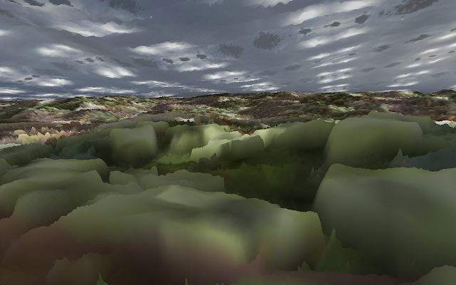
You could also have an inverted acuity gradient, with closer forms more abstract and farther regions more accurate, as in the lo-fi photogrammetry approach of Ian MacLarty’s Southbank Portrait or Zheng Fang's Ru Cun Chu Cheng.
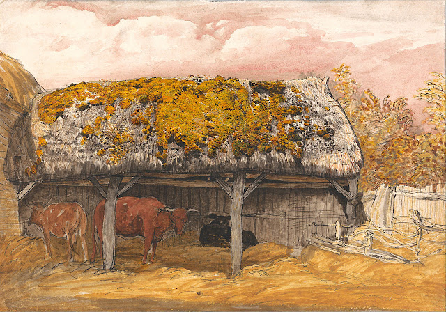
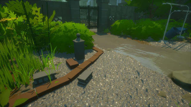
There’s definitely some digital phytopoesis out there which achieves felicity in simplification: The Witness and Rainy Season are two examples that immediately come to mind. But even then, they maybe lack the mystical obsessiveness and favoritism that characterizes the best landscape art. Would we cherish the work of Samuel Palmer if he cared for every growth-form as much as he cared for fluffy blooms?
 |
| Southbank Portrait, 2015 |
 |
| Samuel Palmer, Cow Lodge with a Mossy Roof, 1829 |
 |
| Rainy Season, 2020 |
Anyway, I’ll just wrap things up here with a nod to the idea of economy. I think audiences appreciate it (more than they’re often given credit for) when they feel an artist has spent their limited resources wisely. Recycled animations, kitbashing — resourcefulness, guided by vision, engenders a sense of elegance — even if it’s a kludgy sort of elegance. Having your level-of-detail solution participate ostentatiously in the management of such resources can, I believe, deepen and enrich 3D video games’ uniquely dynamic visual and kinesthetic gestalt.